Coins
Posted on
I've had the idea for an app that would simply show you the value of your bitcoins at a glance. Lots of Shares users have requested bitcoin support in Shares, but it would be very different since it's a lot different than a stock. Coins is just a simple little app that tells you how much your bitcoins are worth.
Starting
This is the story of designing, building, and submitting the app in one day.
On December 20th, I decided I'd hack on it for a few minutes. I had been in Kentucky for several days now for some family stuff. Now that everything settled down, I was excited to just mess around for a bit.
My wife and I started watching Chuck from the beginning. We were just sitting on the couch and about noon I pulled out my MacBook to leisurely play on Twitter or something. A friend had just DM'd me about bitcoin support in Shares so I decided I'd just open up a new project and start working on it for few minutes.
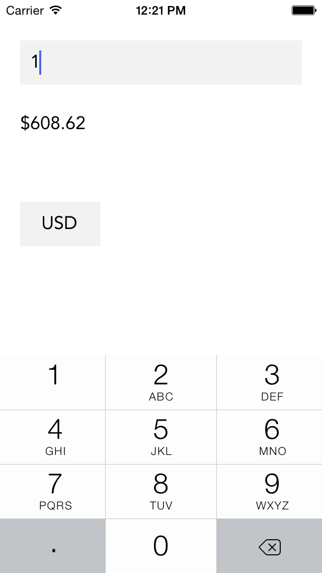
About an episode of Chuck later, I had something that basically worked. It could pull the conversion rate from an API, get the number of bitcoins a user had, and show the total value. Awesome!

Design
Now that I had an app that sorta worked, I wanted to see how far I could get with it before we had to go out for the day. I opened up Sketch and messed around for a bit. Since it was so simple, I knew I just wanted text over a simple background.
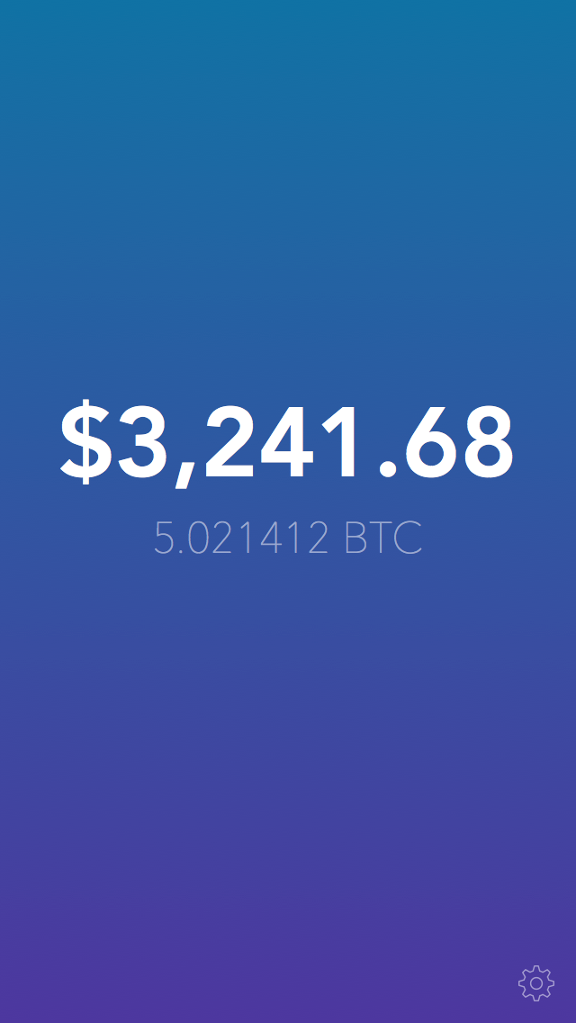
A few minutes later I had something I was sorta happy with. It was just a gradient with white text at varying alpha. Easy enough. Yay iOS 7 for lowering the barrier to entry.

Implementation
Well now that I have an ugly app that sorta works and a design I'm decently happy with, it was time to get started on the real work. All of the real work was making it pretty and polished. This took about 60% of the total time I spent on the app. Animating between states more gracefully was a good part of it.
After getting mostly done, I decided I should make it a universal app since the design is so simple. Adapting to iPad didn't take too long. Most of it was just replacing a navigation controller push with a popover controller and fixing a few orientation issues related to that.
It took awhile to figure out how to adapt one of the elements in my crap version to match the design since I didn't sketch that out earlier. Finally landed on something I was pretty happy with after about an episode or two's worth of messing around.
Icon
At first, it was just a dollar sign over the gradient that matches the background of the app. My lovely wife said she didn't know that it was for bitcoins by looking at the app. Made me feel dumb. Swapped it out with the bitcoin logo and was much happier with it. (Except for the fact that the logo is tilted. That drives me nuts.)
![]()
Lessons
This is the first time I've made an app entirely in one day. I learned a lot looking back on it. Doing the entire process I usually do this quickly was very interesting. It helped weed out the stuff that wasn't essential as far as analyzing what I do.
Piddling is essential for me. If I just sat down in a room by myself, it hard for me to stay motivated. Looking away and watching Chuck here and there kept it fun and didn't make it feel like work.
Having something that works before I get into design keeps me excited about the final output. If I start with design, I just flounder for awhile and give up. Once I have something that works, it's easier to envision the final output design wise.
Overall this was a great experience and a good day. I really impressed myself with what I could accomplish in just a few hours. Taking it from something that sorta worked to a decently polished app is hard. It's good to practice this. Like I said, it took way longer to do all of the "finishing" than the actual building.
Hopefully you learned something or at least found something interesting. Check out Coins and let me know what you think on Twitter.