My Grid System
Posted on
There's a lot of people using responsive CSS grid systems these days. Twitter's Bootstrap and Nathan Smith's 960 Grid System are two really popular ones.
I've never really been a fan of grid systems. Having tons of divs with classes that correspond to layout all over the place just feels wrong and makes your code look ugly. Anyway, I have a really basic way of doing things that I guess is technically a grid system, but I don't like to think of it like that.
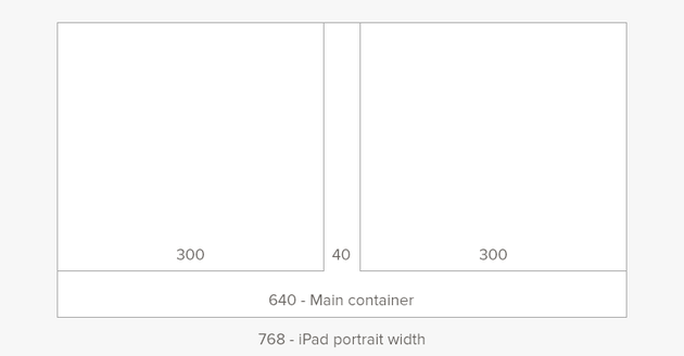
Here's the basic layout:

Everything is 640px wide. (Note, whenever I reference 1px (one pixel), I'm referring to how CSS deals with pixels. On a Retina device, 1px in CSS is actually 2px on the screen.) Nothing is wider than 640px ever. This makes supporting the desktop and iPad work with no modifications. As much as possible is in one column and the content is flexible. Sometimes, the best way to lay something out is columns. There are never more than 2 columns. They are always 300px wide (with a 40px gutter).
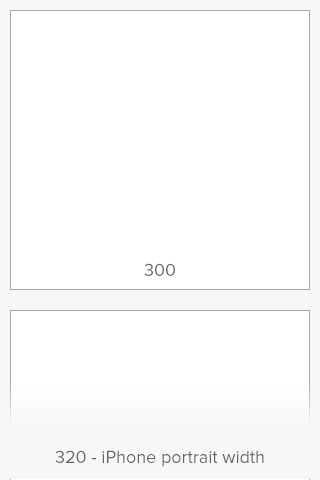
Choosing 300px is key. The 40px gutter is nice and gives lots of space, but the main reason is that 300px works on iPhone with zero modifications. Here's the iPhone version of the "grid":

This makes being responsive really easy. I simply make the columns stack instead of floating next to each other.
I really like having only 2 states of the grid. It's either next to each other or stacked. This makes developing and testing on devices go much faster. I also find the constraints quite nice when designing.
This is the grid system that I use in Cheddar, my projects page, and literally everything else I do. Not all of them use columns, but everything is 640px.
I've thought about open sourcing it, but there is so little code it almost seems silly. Maybe once Cheddar launches, I'll put something together and toss it on GitHub.