Why Crazy Column Designs Are Bad
Posted on
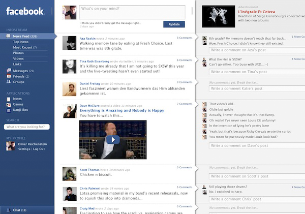
So maybe you've seen #newtwitter, this post on TechCrunch about Facebook with columns, or Twitter for iPad. They all have crazy column layouts. Twitter for iPad is super impressive. I have mad respect for them. The way the columns stack and scroll is really, really impressive.
Anyway, crazy multi-columns layouts are bad. Think of the average user.
The Average User
If you think about it, the average person that uses Facebook is significantly less technical than anyone who reads my blog. They are the kind of people that freak out when Facebook changes their design and have to re-learn how to do their crap. This is who I'm talking about. It helps to picture the average user as my mom.
So say the average user (aka, my mom), wants to view their news feed. They just want to see their news. They don't want all of this meta data that people like us (the technical people) want. The can't handle designs like this:
Why This Is Bad
The average user is lazy. There is too much to look at. They won't take the time to sort through the information and see which part is the part they care about, they will write the page off as "too technical for them" and walk away or they will be really overwhelmed and take a long time to fight through and find what they need. Power users like us are used to this. That's why we are able to pick up new software and start using it right away. Most people don't have that skill.
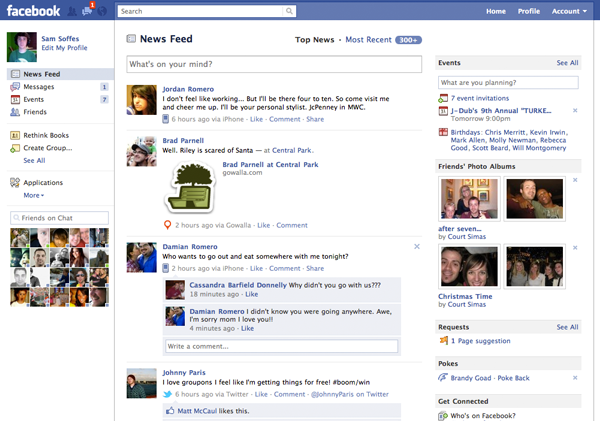
We've had to train our brains at reading through lots of data and picking out the important parts and then focusing on that. Most users aren't good at this. They want something like this:

They want a single column with big images and icons depicting what everything is. This approach is easy and linear. The side navigation is easily interpreted and written off as stuff they don't care about at the moment. If you think about it, the news feed is already really complex for most people.
Conclusion
All of that said, I really like #newtwitter and Twitter for iPad. I know a lot of "average users" like it too. I'm glad. I'm not knocking Twitter. They have done a really great job with their new interfaces.
I just think that if you are designing an interface, it would be better to error on the side of simple than complex, especially if your target market is the average person and not all power users. I really hope Facebook keeps a simpler design and doesn't move to a crazy column one. That said, it might be the push that average people need to get them to start using more complex UI.
